How to use color on the plate — and why it changes the taste
Color is the first thing a diner reads and the fastest thing a cook can fix. This guide gives you the cook's color wheel, the three moves that organize any plate, and the research on what color does to flavor before the first bite.
The photos on this page are AI-generated illustrations.
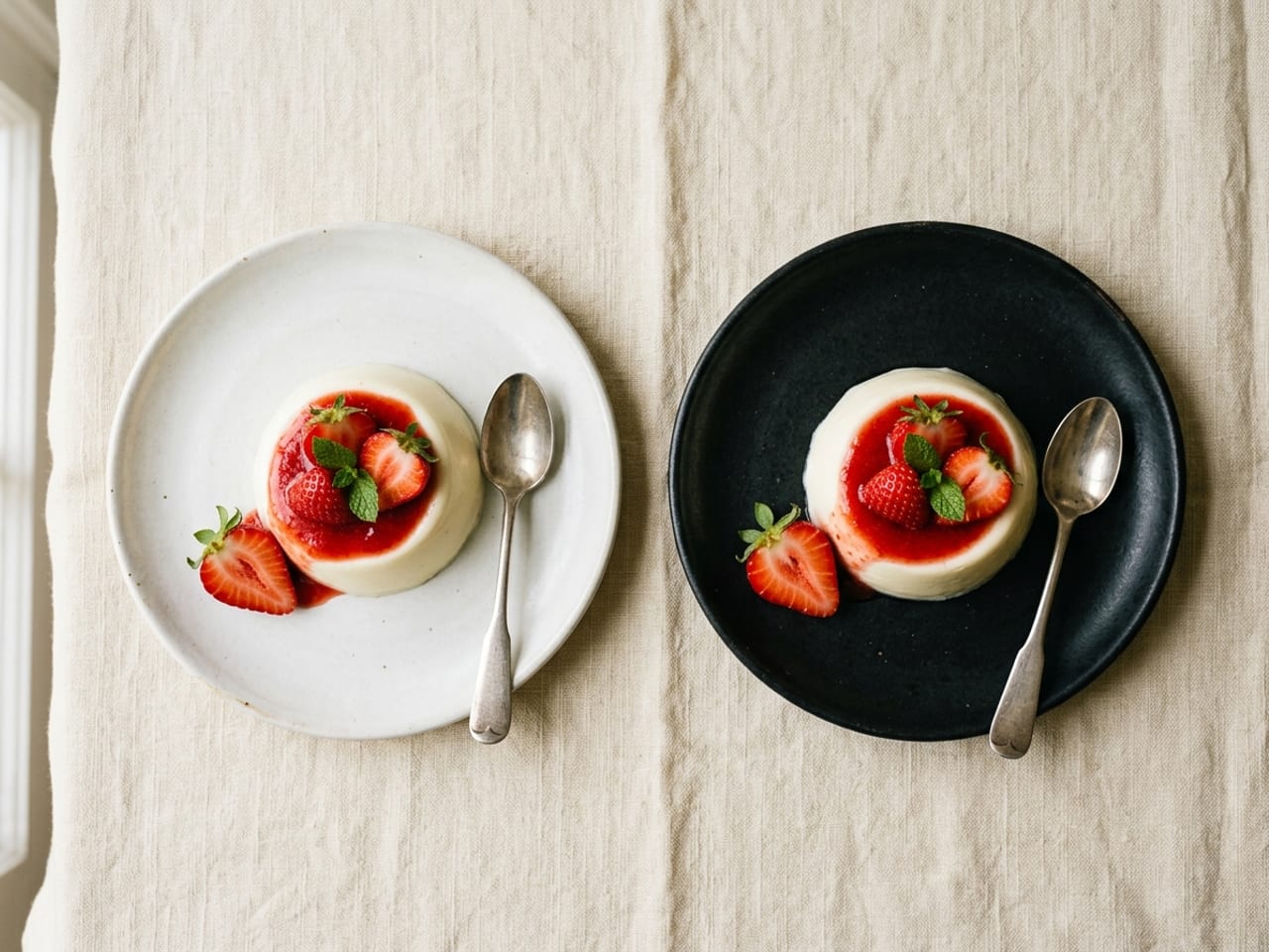
Serve the identical strawberry dessert on a white plate and on a black one, and something strange happens: on white it's rated sweeter, more intense and better liked — same spoon, same recipe.1 Color isn't the icing on a finished plate; it's part of how the plate tastes. And unlike knife skills or sauce work, it costs almost nothing to improve: most color decisions are made in the shopping basket and the last ninety seconds before serving.
Like composition, color is a learnable system, not a gift. Chefs run a handful of repeatable moves — a base, a contrast, an accent, a frame — and every one of them works on a Tuesday schnitzel as well as on a tasting menu. Every study this guide leans on is listed at the bottom.
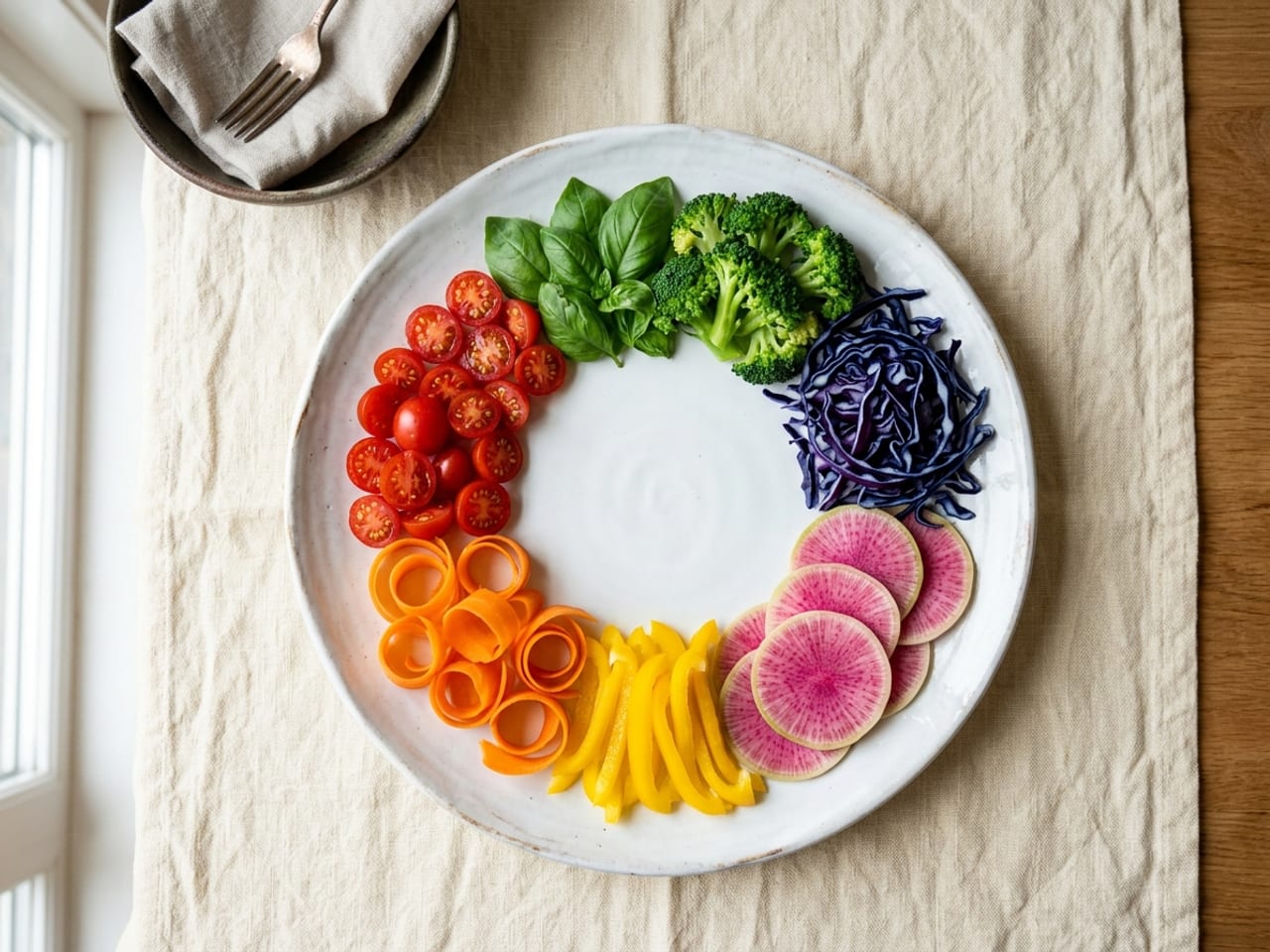
The cook's color wheel
An artist mixes pigments; a cook shops for them. This is the whole palette, and where each hue actually comes from.
- Reds and pinks — tomato, radish, pickled red onion, beet, berries, chili. The loudest colors on the wheel and the ones we read as sweet or ripe.2 A little goes a long way.
- Oranges and golden browns — carrots, squash, citrus, egg yolk, and above all the browns of searing and roasting. Cooked food drifts here by itself; this is your warm base, not your accent.
- Greens — herbs, leaves, blanched vegetables, herb oil. The freshness channel: green tells the diner something on this plate was alive and crisp minutes ago.
- Purples — red cabbage, beets, blueberries, purple potatoes. Rare enough to feel luxurious; one shaving of raw purple cabbage can carry a whole winter plate.
- Whites and creams — starches, dairy, and the plate itself. Not "no color": this is the canvas the other hues stand against.
- Blue — practically absent from real food, which is why people struggle to read blue as edible at all.2 Treat blue as a plate-and-napkin color, never a food goal.
Six ways to put color to work
Every plate that "just looks right" is running some combination of these six moves.
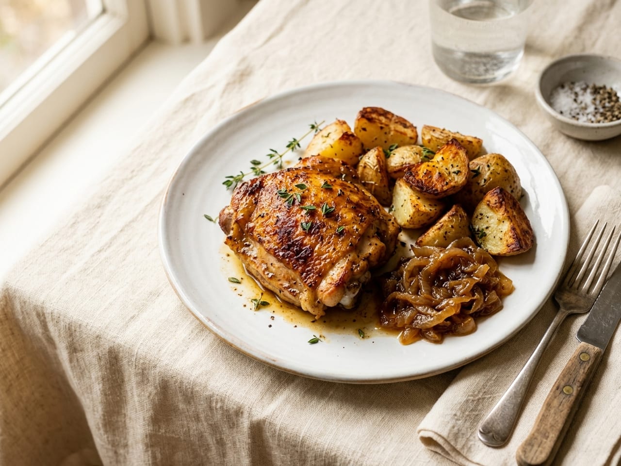
Let the browns be the base
Seared, roasted and baked food drifts golden-brown on its own — that's the Maillard reaction, and it's the color of flavor. Don't fight the beige; treat it as the warm base note that every accent will pop against.
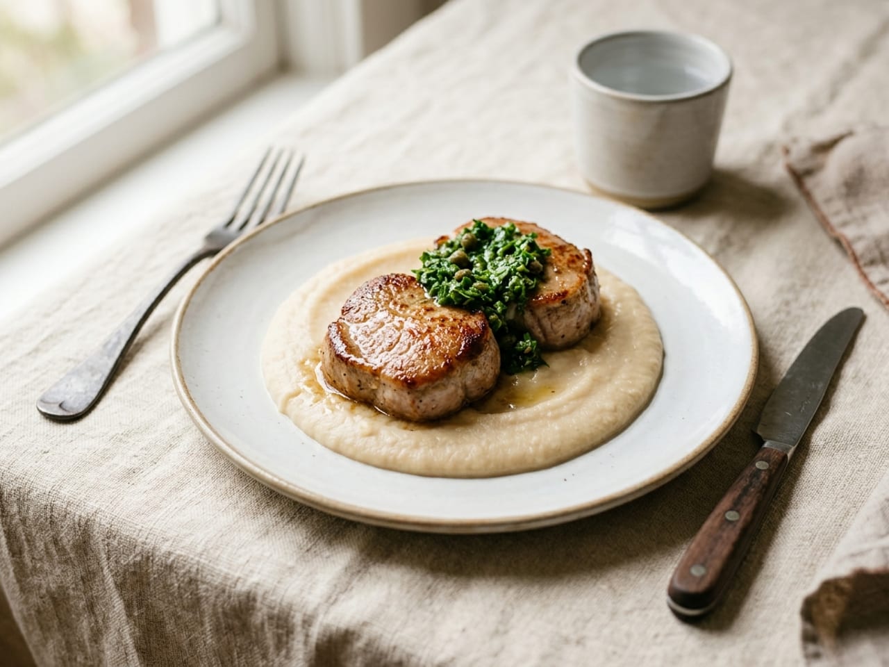
Add one hit of color
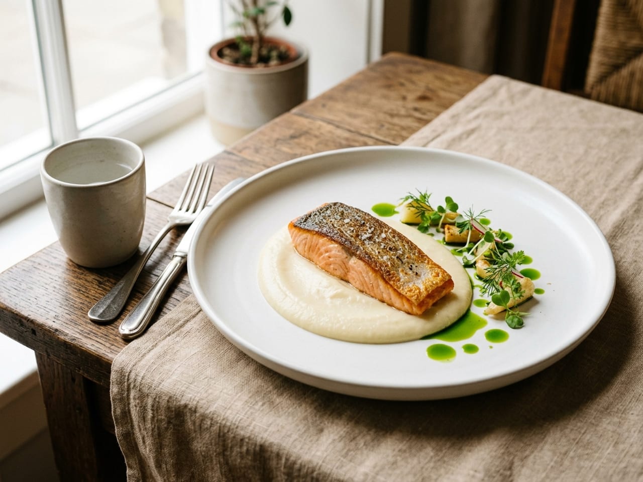
Before you add three colors, add one. A single saturated element — herbs, pickled onion, a charred lemon wedge — wakes up an entire beige plate. One committed accent reads as intent; a little of everything reads as accident.
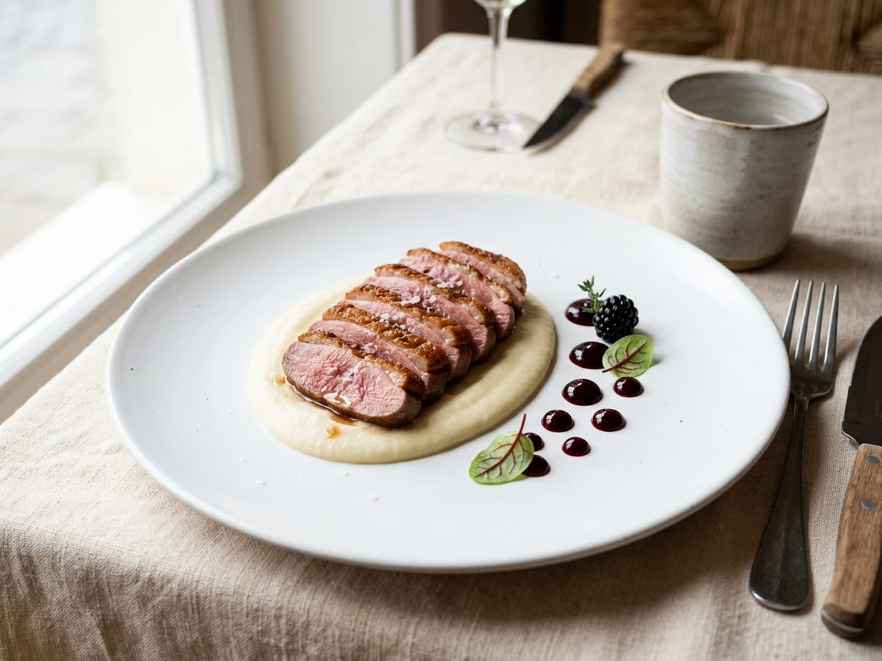
Compose in 60-30-10
Borrow the interior designer's ratio: about 60% calm canvas (the plate and the starch), 30% supporting color (usually the hero protein or vegetable), 10% vivid accent. Plates that feel 'balanced' are almost always some version of this.
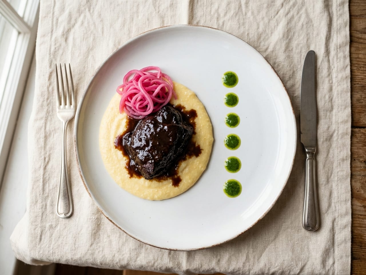
Cluster color, don't confetti it
Put the accent in one place — a tangle of pickled onion at eleven o'clock, a line of herb-oil dots down one side. Scattered evenly across the plate, the same ingredient stops being a decision and becomes noise.
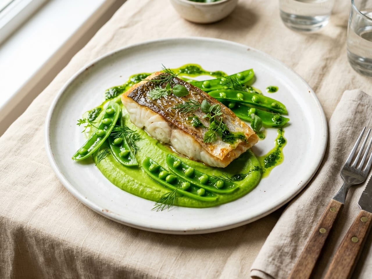
Green is the cheapest saturated color
Soft herbs, a drizzle of herb oil, glossy blanched greens — nothing else buys this much freshness per euro. Green also carries meaning: diners read it as fresh and just-finished, which is exactly the story you want told.
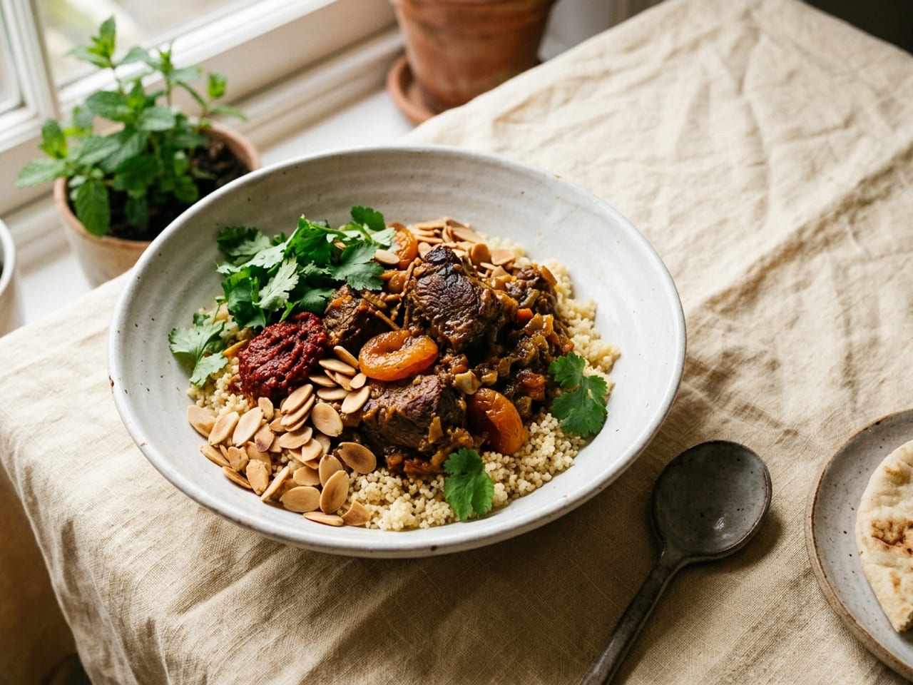
Earn every color
Color has to come from an ingredient the dish actually wants — the garnish rules apply. Raw bell pepper confetti on a braise adds hue and subtracts sense. If a color doesn't bring a flavor the plate needs, it doesn't belong.
What one minute of color buys you
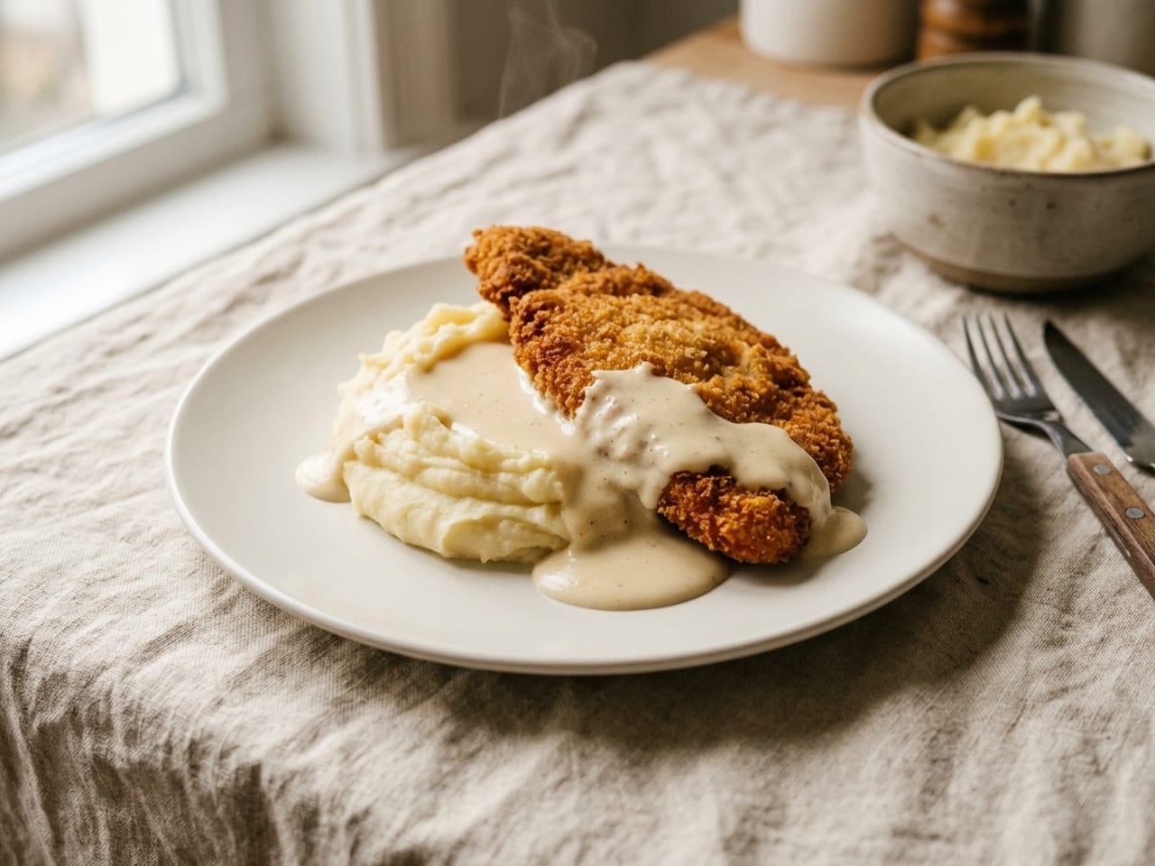
The same schnitzel and mash, sixty seconds apart: blanched peas, parsley, pickled red onion, one charred lemon wedge.
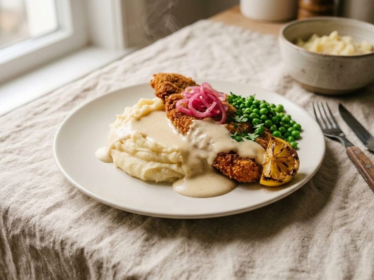
 BeforeAfter
Does color affect taste? What the research says
Color-and-flavor is one of the best-studied corners of gastronomy. Five findings every cook should know.
- The plate's color changes the food's flavor. The identical strawberry dessert was rated significantly more intense, sweeter and better liked served from a white plate than from a black one.1 Identical popcorn, likewise, tasted sweeter or saltier depending on the color of its bowl.3
- We map colors to tastes — consistently. Across studies and cultures, people pair red-pink with sweet, green with sour and fresh, white with salty, black with bitter. It's not synaesthesia; it's the statistics of every meal you've ever seen, internalized.2
- Deeper color reads as stronger flavor. The same salsa was expected to be — and rated — spicier when its red was darker; when the color didn't match the heat, tasters' ratings dropped.4 Pale sauces promise mild; saturated ones promise intensity. Keep the promise.
- Red plateware is not a diet trick. A 2012 study found people snacked less from a red plate than from blue or white ones and read red as an avoidance signal,5 but a larger direct replication found the opposite: people ate more from the red plate.9 Choose a red plate for how it frames the food, not to change how much anyone eats.
- Colorful reads as tasty — and gets eaten. Diners rated colorful buffet meals the tastiest, and a daily "eat a colorful lunch" prompt reliably shifted real choices toward vegetables.6 Across 2,818 smartphone-logged meals, perceived color variety tracked vegetable content in every meal type.7 In a 2025 plating study, red-dominant plates drew the highest acceptance while blue plating pulled mostly negative emotion terms.8
The thread through all of it: color sets an expectation, and the expectation becomes part of the tasting. A cook who controls the colors on the plate is seasoning the meal before the fork moves.
Choose the plate like a painter chooses the frame
- White is the default for a reason. It flatters nearly everything, makes saturated colors pop — and in testing it even made dessert taste sweeter.1 When in doubt, white.
- Dark plates are for pale food. Scallops, risotto, panna cotta, burrata — pale food vanishes on white and glows on slate or matte black. The frame's job is contrast with the food, not with the tablecloth.
- Red plateware fights red food. Tomato, beet or berry on a red plate loses the contrast that makes it read, and the appetite effect people cite for red plates did not replicate.9 Save red plates for pale or green food.
- Patterns fight the food. A busy plate is a busy frame. If you love a patterned set, save it for single-color food that can hold its own — and keep the composition dead simple.
If you want the answer for one specific dish rather than the whole rulebook, the plate colour pairing tool is the short version: pick the dominant colour of your food (or the plate you own) and it names the match, the runners-up and the one to keep it off.
The 60-second color audit
Run this on tonight's dinner just before it leaves the kitchen.
- Count your huesCanvas, support, accent — three is plenty. If you count five or more competing colors, remove something instead of adding more.
- Run the squint testStep back and squint at the plate. Exactly one thing should pop. If nothing pops it's beige; if everything pops it's chaos.
- Check the accent is clusteredYour brightest element should live in one deliberate place, not be sprinkled from height across the whole composition.
- Make every color pay flavor rentPoint at each colorful element and name what it adds to the taste. Anything you can't answer for comes off the plate.
- Look at the plate itselfThe plate is the frame: it should contrast the food. Pale food disappearing into a white plate needs a darker frame — or a bolder sauce.
Five color mistakes that flatten a plate
If a plate looks dull and you can't say why, it's almost always one of these.
- All-beige everythingSchnitzel, mash, cream sauce, white plate — a monochrome wall. It's the most common plating problem there is, and one green-plus-one-bright element fixes it in under a minute.
- The rainbow pileSix colors with no hierarchy is as flat as one. Color needs a canvas to stand against — decide what dominates, what supports and what accents, then cut the rest.
- Color that costs flavorInedible flowers, raw pepper confetti, a swoosh of a sauce that doesn't belong — decoration bought at the price of taste. If it wouldn't be missed by the tongue, the eye doesn't need it either.
- Army-green vegetablesOvercooked greens turn olive-drab and take the whole plate down with them. Blanch, shock in ice water, and dress with acid only at the last second — vinaigrette starts dulling green the moment it lands.
- Fighting the plateBusy patterned plates compete with the food and usually win. And watch the frame-food match: pale risotto on bright white, dark braise on black slate — both vanish into their background.
Train your eye on your own dinner
Color sense builds the same way palate does: by tasting differences side by side. Photograph tonight's plate from straight above, run the 60-second audit, fix one thing, and photograph it again. The camera flattens flattery — it shows you the beige your hungry eyes forgive.
Plate Artists closes that loop for you. Upload the photo and the AI re-plates your own dish — same food, same angle — the way a fine-dining kitchen would send it, with concrete steps explaining what changed. You can even choose the plate color before it renders, and re-plate the same dish onto white, slate or terracotta to see the frame effect from this guide on your own cooking.
See tonight's dinner in full color
Snap your next plate and get the fine-dining version back — plus the exact steps to plate it that way yourself, on the plate color you pick.
Start free · 1 enhancement →Free account · 1 free enhancement · No credit card
Color questions, answered
Does color affect taste?
Yes — measurably. The identical strawberry dessert served on a white plate was rated more intense in flavor, sweeter, and better liked than on a black plate (Piqueras-Fiszman et al., Food Quality and Preference, 2012). Identical popcorn tasted different depending on the color of the bowl (Harrar et al., Perception, 2011), and the same salsa was rated spicier when its red was deeper (Shermer & Levitan, Multisensory Research, 2014). Color sets an expectation, and the expectation becomes part of the tasting.
What colors make food look most appetizing?
Warm colors do most of the work: golden Maillard browns, reds and oranges signal ripeness, roasting and flavor, and fresh green signals just-made freshness. In a 2025 study of plating colors, red-dominant plates got the highest acceptance scores while blue elicited mostly negative associations — true blue barely exists in food, so we don't read it as edible.
What is the 60-30-10 rule on a plate?
A ratio borrowed from interior design: roughly 60% of the visual field stays calm (the plate and the starch or purée), 30% is a supporting color (usually the protein or main vegetable), and 10% is a vivid accent (herbs, pickle, a bright sauce). It's a starting proportion, not a law — but plates that feel balanced usually turn out to be some version of it.
How do I add color to a beige dish?
Keep a small arsenal of last-minute color: chopped soft herbs or a quick herb oil (green), pickled red onion or a few pomegranate seeds (pink-red), a charred lemon wedge (gold), blanched peas or broccoli (bright green), a dusting of paprika or chili flakes (warm red). Add one, at most two, placed in one deliberate spot — not scattered.
Should I use a white plate or a colored plate?
White is the default for a reason: it frames almost everything, and in testing it even made the identical dessert taste sweeter and more intense than a black plate. Reach for dark plates when the food itself is pale — scallops, risotto, panna cotta. Skip red plateware as a diet trick: an early study found people snacked less from red plates, but a larger replication found they ate more.
Do colorful meals actually taste better?
People think so — and behave like it. In buffet experiments, diners rated colorful meals the tastiest, and prompting people to 'eat a colorful lunch' reliably shifted their choices toward vegetables and fruit (König & Renner, BMC Public Health, 2019). Across 2,818 real meals logged by smartphone, perceived color variety tracked vegetable content across every meal type. The caveat: variety needs hierarchy — three organized colors beat six competing ones.
The research behind this guide
Peer-reviewed studies, retrieved via PubMed and Crossref. Every figure quoted above comes from one of these papers.
- Piqueras-Fiszman, B., Alcaide, J., Roura, E., & Spence, C. (2012). Is it the plate or is it the food? Assessing the influence of the color (black or white) and shape of the plate on the perception of the food placed on it. Food Quality and Preference, 24(1), 205–208. doi:10.1016/j.foodqual.2011.08.011
- Spence, C., & Levitan, C. A. (2021). Explaining crossmodal correspondences between colours and tastes. i-Perception, 12(3). doi:10.1177/20416695211018223
- Harrar, V., Piqueras-Fiszman, B., & Spence, C. (2011). There’s more to taste in a coloured bowl. Perception, 40(7), 880–882. doi:10.1068/p7040
- Shermer, D. Z., & Levitan, C. A. (2014). Red hot: The crossmodal effect of color intensity on perceived piquancy. Multisensory Research, 27(3–4), 207–223. doi:10.1163/22134808-00002457
- Genschow, O., Reutner, L., & Wänke, M. (2012). The color red reduces snack food and soft drink intake. Appetite, 58(2), 699–702. doi:10.1016/j.appet.2011.12.023
- König, L. M., & Renner, B. (2019). Boosting healthy food choices by meal colour variety: results from two experiments and a just-in-time Ecological Momentary Intervention. BMC Public Health, 19, 975. doi:10.1186/s12889-019-7306-z
- König, L. M., Koller, J. E., Villinger, K., Wahl, D. R., Ziesemer, K., Schupp, H. T., & Renner, B. (2021). Investigating the relationship between perceived meal colour variety and food intake across meal types in a smartphone-based ecological momentary assessment. Nutrients, 13(3), 755. doi:10.3390/nu13030755
- Silva, J., Lima, F. E., Souza, C., Moreira-Leite, B., & Sousa, P. (2025). The influence of food colors on emotional perception and consumer acceptance: A sensory and emotional profiling approach in gastronomy. Foods, 14(22), 3818. doi:10.3390/foods14223818
- Steele, K. M., & Rash, L. L. (2021). Is the suppression effect of the color red on snack food consumption reliable? Experimental Psychology, 68(4), 214–220. doi:10.1027/1618-3169/a000524
Keep going
Plate colour pairing tool
The free tool built on this guide: your food's colour in, the plate that flatters it out, plus the one that makes it vanish.
Plating 101 — the composition guide
Color is one lever; composition is the rest. The clock method, height, negative space, sauce work and garnish rules — in one guide.
Cook something worth coloring
100+ recipes with step-by-step methods — each one a fresh canvas to practice the color audit on.
Photograph what you plated
Color reads loudest through a lens: where to put the light, white balance, the three angles and the phone settings.
Types of plates — the dinnerware glossary
Every plate, bowl and platter defined and sized: charger to saucer, rimmed to coupe, porcelain to slate, and which one to plate on.